Pivot Tables for E-commerce Analysis | Analyze 10K Orders in 60 Seconds
Stop manually grouping orders by SKU, date, or channel. Pivot tables let you slice 10,000 orders by any dimension in seconds - top SKUs, revenue by month, margins by category. Drag, drop, done.
What Pivot Tables Actually Do (In Plain English)
You have 10,000 orders from Shopify. Each row is one order with: Order ID, Date, SKU, Quantity, Revenue, Customer, Channel. Questions you want answered:- Which SKUs made the most money?
- What's my revenue by month?
- Which customers bought the most?
- How does Shopify compare to Amazon revenue?
The Anatomy of a Pivot Table
Every pivot table has 4 areas you drag fields into:1. Rows (What you want to see listed vertically)
- SKUs (product performance)
- Customers (customer ranking)
- Categories (category analysis)
- Dates (when grouped, shows trends over time)
2. Columns (What you want to see across the top)
- Months (month-over-month comparison)
- Channels (Shopify vs Amazon side-by-side)
- Product types (compare categories)
- Empty for simple lists
3. Values (What you want to calculate/sum)
- SUM of Revenue
- SUM of Profit
- COUNT of Orders
- AVERAGE of Order Value
4. Filters (What you want to filter by)
- Date range (show only Q4 2024)
- Category (show only "Apparel")
- Channel (show only "Shopify")
- Any field you want to slice by
Visual Example:
Your Raw Data (10,000 rows):Order ID | Date | SKU | Revenue | Channel
1001 | 2024-01-05 | ABC | $50 | Shopify
1002 | 2024-01-05 | XYZ | $30 | Amazon
1003 | 2024-01-06 | ABC | $50 | Shopify
... 9,997 more rowsSKU | Total Revenue
ABC | $125,000
XYZ | $98,500
DEF | $76,200Create Your First E-commerce Pivot Table (5 Minutes)
Export Your Orders from Shopify/WooCommerce
Go to Orders → Export → All Orders → CSV. Save the file. You need at least: Order ID, Date, SKU, Revenue, Quantity columns.
Open CSV in Excel
Right-click CSV file → Open With → Excel. DO NOT double-click (corrupts data). Now you have a table with headers in row 1, data starting row 2.
Select Your Data Range
Click any cell in your data. Don't select anything - just click one cell. Excel auto-detects the range. (Or select all: Ctrl+A)
Insert Pivot Table
Go to: Insert tab → PivotTable button. Dialog appears. 'Select a table or range' should show your data. Click OK. New sheet opens with empty pivot table.
Drag SKU to Rows
On right side, you see 'PivotTable Fields' panel. Find 'SKU' field, drag it to 'Rows' box at bottom. Your pivot table now lists all unique SKUs.
Drag Revenue to Values
Find 'Revenue' field, drag it to 'Values' box. Excel automatically does SUM. Now you see each SKU with its total revenue.
Sort by Revenue (Highest First)
Click dropdown arrow next to 'Row Labels'. Choose 'More Sort Options' → Descending by 'Sum of Revenue'. Now top revenue SKUs appear first.
Add Filters (Optional)
Drag 'Date' to Filters box. A filter dropdown appears above pivot table. Click it, select date range. Pivot table instantly updates to that period only.
7 Pivot Tables Every E-commerce Seller Needs
1. Top Products by Revenue
Business Question: "What are my best-selling products?" Pivot Table Setup:- Rows: SKU or Product Name
- Values: SUM of Revenue
- Sort: Descending by Revenue
- Drag Quantity to Values (below Revenue)
- Now you see both revenue AND units sold per SKU
2. Revenue by Month (Trend Analysis)
Business Question: "How are my sales trending month-over-month?" Pivot Table Setup:- Rows: Date (Excel auto-groups by Month)
- Values: SUM of Revenue
- Right-click any date in pivot table
- Select "Group"
- Choose "Months" and "Years"
- Click OK
- Click anywhere in pivot table
- Insert → Chart → Line Chart
- Instant month-over-month trend visualization
3. Revenue by SKU by Month (Cross-Tab)
Business Question: "Which products are growing vs declining month-to-month?" Pivot Table Setup:- Rows: SKU
- Columns: Date (grouped by Month)
- Values: SUM of Revenue
- Scan across a row to see one SKU's trend
- Scan down a column to see all SKUs for one month
- Empty cells = no sales that month
- Select all values in pivot table
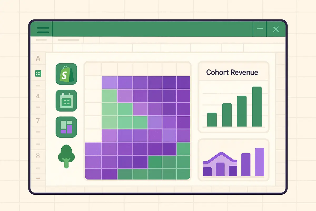
- Home → Conditional Formatting → Color Scales
- Red = low, Green = high
- Instantly spot trends visually
4. Profit Analysis by Product (Needs COGS Data)
Business Question: "Which products are MOST profitable (not just highest revenue)?" First, Add COGS to Your Data:- Use VLOOKUP to add COGS column to orders: `=VLOOKUP(SKU, ProductCostTable, 2, FALSE)`
- Add Profit column: `=Revenue - (COGS × Quantity)`
- Rows: SKU
- Values: SUM of Revenue, SUM of Profit
- Calculated Field for Margin %: (SUM of Profit / SUM of Revenue) × 100
- Click pivot table
- PivotTable Analyze tab → Fields, Items, & Sets → Calculated Field
- Name: "Margin %"
- Formula: `=Profit/Revenue*100`
- Click OK
5. Customer Analysis (Top Customers by Spend)
Business Question: "Who are my top 20 customers?" Pivot Table Setup:- Rows: Customer Email or Customer Name
- Values: SUM of Revenue, COUNT of Orders
- Sort: Descending by Revenue
- Filter to customers with > $500 spent
- Filter to customers with > 3 orders
- These are your repeat, high-value customers
- VIP email campaigns
- Exclusive discount codes
- Early access to new products
- Personal thank-you messages
6. Channel Performance Comparison (Shopify vs Amazon)
Business Question: "Which sales channel is most profitable?" Pivot Table Setup:- Rows: Channel (Shopify, Amazon, eBay, etc.)
- Values: SUM of Revenue, SUM of Profit, COUNT of Orders
- Average Order Value: Revenue / Order Count
- Profit Margin %: (Profit / Revenue) × 100
- Shopify: Higher margins (lower fees)
- Amazon: Higher volume, lower margins (FBA fees)
- Own website: Highest margins, lowest volume
7. Product Category Performance Matrix
Business Question: "Which product categories should I invest in?" Pivot Table Setup:- Rows: Category
- Columns: Quarter or Month
- Values: SUM of Revenue
- Right-click any value → Show Values As → % Difference From
- Base Field: Date, Base Item: Previous
- Now each cell shows % change from previous period
- Growing categories: Increase inventory, add more SKUs
- Declining categories: Clear out, reduce investment
- Stable categories: Maintain current levels
Advanced Pivot Table Techniques for E-commerce
Grouping Dates (Weekly, Monthly, Quarterly, Yearly)
By default, Excel lists every individual date. That's useless for trends. Group Dates: 1. Right-click any date in Rows 2. Select "Group" 3. Check boxes: Months, Quarters, Years (uncheck Days) 4. Click OK Now you have collapsible groups:- Click "+" next to 2024 to expand into quarters
- Click "+" next to Q1 to expand into months
- Instant drill-down from year → quarter → month → day
Calculated Fields (Create New Metrics)
Example: Average Order Value You have SUM of Revenue and COUNT of Orders. You want AOV. 1. Click pivot table → PivotTable Analyze tab 2. Fields, Items, & Sets → Calculated Field 3. Name: "AOV" 4. Formula: `=Revenue/Orders` 5. Click Add, then OK New column appears: Average Order Value for each SKU/month/whatever. Other Useful Calculated Fields:- Margin %: `=Profit/Revenue*100`
- Return Rate: `=Refunded_Orders/Total_Orders*100`
- Units per Order: `=Total_Units/Order_Count`
Show Values As (Percentages, Ranks, Running Totals)
Right-click any value in pivot table → Show Values As: % of Column Total:- Shows each SKU as % of total revenue
- Answers: "What % of my revenue is this SKU?"
- Shows each month as % of that SKU's total
- Answers: "What % of this SKU's annual revenue was in January?"
- Shows each SKU's rank (1st, 2nd, 3rd best seller)
- Shows cumulative revenue over time
- Answers: "How much revenue have I made year-to-date?"
- Shows month-over-month or year-over-year growth %
- Instant growth rate calculation
Pivot Table Slicers - Visual Filters for Non-Technical Users
The Problem:
Your manager/investor/partner isn't Excel-savvy. They don't know how to use filter dropdowns.The Solution: Slicers
Add Slicers: 1. Click pivot table 2. PivotTable Analyze tab → Insert Slicer 3. Check boxes: Category, Channel, Quarter 4. Click OK Three visual buttons appear:- Category buttons: Electronics, Apparel, Home
- Channel buttons: Shopify, Amazon, eBay
- Quarter buttons: Q1, Q2, Q3, Q4
- Click "Electronics" button → Pivot table instantly filters to electronics only
- Click "Q4" button → Now showing Q4 electronics only
- Click again to deselect
- Multi-select: Ctrl+Click to select multiple categories at once
| Pivot Table | Rows | Columns | Values | Business Question Answered |
|---|---|---|---|---|
| Top Products | SKU | None | SUM(Revenue) | Best-selling products ranked |
| Monthly Trend | Date (Month) | None | SUM(Revenue) | Is revenue growing? |
| Product-Month Matrix | SKU | Date (Month) | SUM(Revenue) | Which SKUs trending up/down? |
| Channel Comparison | Channel | None | SUM(Revenue), SUM(Profit) | Most profitable channel? |
| Top Customers | Customer Email | None | SUM(Revenue), COUNT(Orders) | Who are VIP customers? |
| Category Performance | Category | Quarter | SUM(Revenue) | Which categories growing? |
| SKU Profitability | SKU | None | SUM(Profit), Margin % | Most profitable SKUs? |
Common Pivot Table Mistakes & Fixes
Mistake 1: "My dates won't group by month"
Cause: Dates are stored as text, not dates. Fix: 1. Before creating pivot table, select date column 2. Home → Find & Replace (Ctrl+H) 3. Find: (your date format, e.g., "01/15/2024") 4. Use formula to convert: `=DATEVALUE(A2)` 5. Copy formula down, paste values, delete old column Now dates are real dates. Pivot table will group them.Mistake 2: "Sum of Revenue shows as COUNT of Revenue"
Cause: Revenue column has text values ("$50.00" instead of 50). Fix: 1. Remove $ and commas from revenue column before pivot table 2. Formula: `=VALUE(SUBSTITUTE(SUBSTITUTE(A2,"$",""),",",""))` 3. This converts "$1,234.56" to 1234.56Mistake 3: "Pivot table shows wrong numbers after data update"
Cause: Pivot table cached old data. Needs refresh. Fix: Right-click pivot table → Refresh Prevent Future: PivotTable Analyze → Options → Check "Refresh data when opening the file"Mistake 4: "My pivot table is too big, Excel crashes"
Cause: Too many unique values (100,000 unique SKUs, 10,000 unique customers). Fix:- Filter source data before pivot (e.g., last 90 days only)
- Use pivot table from external data source (Power Pivot)
- Summarize data first (daily totals instead of order-level)
- Use 64-bit Excel (handles more data)
Common Mistakes to Avoid
Verification Checklist
- Your top products pivot table shows SKUs ranked by revenue (highest first)
- Your monthly trend pivot table shows dates grouped by month, not individual days
- Your channel comparison pivot table shows SUM of Revenue, not COUNT
- When you click Refresh, pivot table updates with any new data you added
- You can add a slicer and clicking it filters the pivot table instantly