

The Limits of a Spreadsheet
Spreadsheets are the workhorse of the business world. They are incredible for organizing, cleaning, and calculating data. With Spreadsheet Broccoli, you can automate the flow of this critical data into clean, reliable sheets. But what's the next step?
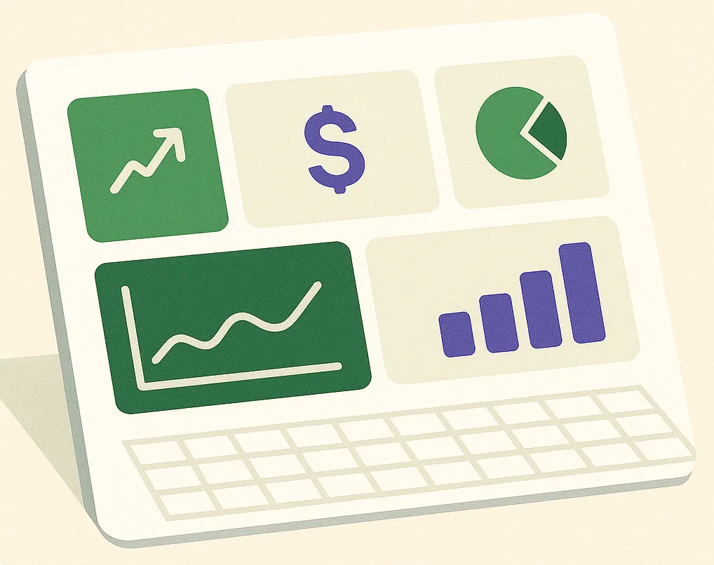
While you can create charts in Excel, they can be static and cumbersome for exploratory analysis. To truly understand trends, spot anomalies, and share insights with your team, you need to step into the world of Business Intelligence (BI) tools.
What are BI Tools?
BI tools are applications that specialize in data visualization and interactive analysis. They connect to your data sources (like an Excel file) and allow you to build dynamic dashboards with a wide range of charts, graphs, maps, and tables.
Think of it this way: Spreadsheet Broccoli provides the clean, automated data fuel, and BI tools provide the high-performance engine to explore it. Getting started with BI doesn't have to be expensive or complicated. Here are three popular choices that work perfectly with the spreadsheets you generate from our platform.
Top BI Tools for Small and Medium Businesses
1. Looker Studio (formerly Google Data Studio)
Best for: Teams already in the Google ecosystem.
Cost: Free.
Looker Studio has a native connector for Google Sheets, making it incredibly easy to use with your automated reports. You can build and share beautiful, interactive dashboards with just a few clicks. It's the perfect entry point into business intelligence.
2. Microsoft Power BI
Best for: Businesses that heavily use Excel and the Microsoft ecosystem.
Cost: Free for the desktop version; paid for sharing and collaboration (Power BI Pro).
Power BI offers deep integration with Excel and boasts powerful data modeling capabilities. If your team lives in Excel, Power BI is the natural next step for advanced visualization.
3. Tableau
Best for: Creating highly polished, presentation-quality visualizations.
Cost: Paid (Tableau Creator, Viewer licenses).
Tableau is known as the industry leader for its beautiful and highly interactive charts. It has a steeper learning curve but offers unparalleled control over the design and functionality of your dashboards.
How to Connect Your Data: A Simple Workflow
The process is straightforward:
1. Automate Your Data: Use a Spreadsheet Broccoli recipe to generate a report and have it automatically update in a Google Sheet or a shared location (like OneDrive for Excel).
2. Connect Your BI Tool: In your chosen BI tool (e.g., Looker Studio), add a new data source and select Google Sheets.
3. Authorize and Select: Point the BI tool to your automated report file.
4. Build Your Dashboard: Start dragging and dropping to create charts. As Spreadsheet Broccoli updates your sheet with new data, your BI dashboard will update automatically.
Ready to fuel your BI dashboards with clean, automated data?
Get Started for FreeConclusion: Unlock the Power of Your Data
Moving beyond spreadsheets into the world of BI is a crucial step in becoming a data-driven organization. It allows you to move from simply *collecting* data to actively *using* it to make faster, smarter decisions.
By pairing the powerful automation of Spreadsheet Broccoli with the visualization capabilities of modern BI tools, you can create a seamless and scalable reporting system that grows with your business.